Monday, June 18, 2018

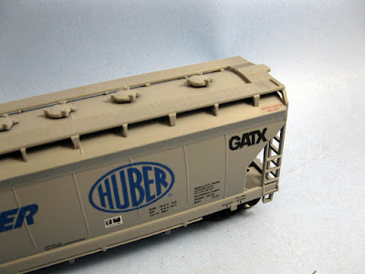
JM Huber GATX Covered Hopper


Over the weekend, I painted and lettered an old Athearn Blue Box ACF covered hopper using custom decals. It was basically a test to see if color decals could work on transparent decal paper. To make a long story short, it works. But only if the base color is very light. For this particular car, I used CN Gray #12 and I would consider it the darker tone before colored lettering start  to shift drastically in shade. However, it would be perfect on a white car.


One thing I also experimented with was not sealing the decals with a clear coating right after printing them. It kept the decals extremely thin, however, they became much more prone to wrinkling which left small marks on the lettering. Thus, next time I'll clear coat the decals before use. It seems to me the gain in term of thinness isn't worth the risk to visually ruin the decals, except for very small ones.

And once again, I found out Walthers decals hardly slide from the carrier paper. I don't know if this is due to laser printer heat altering the bonding agent, if my paper is getting old or if it's a typical occurence with Walthers paper. If you decals are clear coated, it is not a big problem, but if they aren't the risk to destroy them sharply rise.


Anyway, I'm quite satisfied with this experiment. It may not be a prize winning model, but the correct paint scheme is spot on with cars that regularly travelled Murray Bay Subdivision when I was in high school. It's good to see them in miniature. If I find a more accurate and better detailed car at a good price, I'll probably upgrade the fleet. But I have more pressing issues to handle and will thus live with my el cheapo kaolin covered hopper car fleet. I hope to weather this car soon so it can join the fleet before the next operation session.


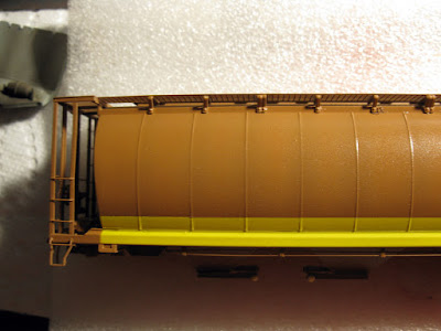
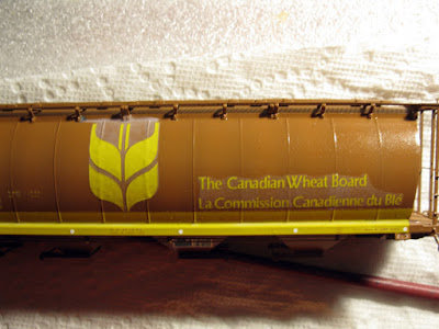
Speaking of experiments, I continued working on my Canadian Wheat Board covered hopper. You probably recall I pre-weathered the car by adding shadows and highlight BEFORE applying decals. Once lettered and sealed, it is hardly noticeable in pictures, but I can assure you it is visible in real life. Depending on prototypes, I'll probably make the effect a little bit more dramatic next time, particularly since many other coats of weathering will cover and subdue the effect. Next time will be an Intermountain cylindrical hopper in light gray CP Rail paint scheme which was converted from round hatches to trough hatches.


By the way, Hedley Junction will switch to a summer schedule starting this week. It means building efforts will be drastically reduced to focus our efforts on making the St-Pie layout up and running. Meanwhile, we will operate extensively the Murray Bay Subdivision in a serious and orderly manner to enjoy the last months of improvements. Some building projects will probably be done, but I would be hardly pressed to promise anything in that regard!

Thursday, June 14, 2018

Beware of Commercial Decals

Once again I bought decals only to find out the font used and letter spacing was slightly (quite in fact) wrong. Set is Microscale 87-1532 and while most of it is quite good, I was shocked to find out the CP Rail name was not accurate at all. I'm always surprised when I see basic errors like that and I decided to do what any people with common sense do: do it myself.

The Multimark CP Rail scheme used the famous Helvetica font family which is generally considered as one of the most iconic modern typeface. Canadian National also used it when it modernized its corporate image in 1960 and many other corporate entities did so.

While Microscale got the font right, I quickly discovered they used it without comparing it with an actual CP Rail car or using any shop diagram. The thing is the guy who developed the Multimark corporate image had a knack for tweaking everything ever slightly. In fact, the italic font isn't the one usually associated with Helvetica, but it's a tad more slanted. Not only that, but the C, P and R letters are slightly more elongated than standard Helvetica. Finally, the "Rail" word letters are weirdly spaced giving a strange look. And no, it's not some fancy interpretation by shop workers. Looking at dozen of pictures it was clear it was the official way to paint the logo. In fact, most scale train manufacturers didn't get that one right. But to their credit, a version with a more standard spacing did exist and was common.

Why does it bothers me? Well, when I draw decal artworks myself, I also scale a picture in Illustrator and try to match as closely my lettering to the prototype. It's the only way to get decent results if you don't have access to original drawings. But as much as I consider this step crucial, it is evident most manufacturers only try to get as close and they can and call it a day.


Before you call me a crazy man with too much time on his hands, just look at this comparison and you will understand how major the discrepancies are. It's not only a matter of fonts and you can see how the real CP Rail logo is much wider than the Microscale version. This has a serious impact when trying to place lettering on a scale model.


So, now I have enough lettering to repaint two Intermountain Cylindrical Hopper in Multimark lettering without the Pac-Man logo. And since I don't like to waste decal paper, I made some neat artwork for J.M. Huber hoppers.

Sunday, June 10, 2018

The Military Way

I recently talked about implementing military modelling techniques into model railroading. It was now time to put my ideas in action. It should be noted adding shadows and highlights is an old trick which I initially learned in the early 2000s when I was building resin figure garage kits. In fact, it is an universal modelling technique and I'm surprised it is seldom used in model railroading.

Among our fleet of grain hoppers, there was a neat Intermountain Branchline Canadian Wheat Board (CWB) hopper. Unfortunately, these lightweight all-aluminium construction hoppers were rare back in the days and didn't visit Quebec often since they were kept in service on rural branchlines in the Prairies. For this reason, it had to be repainted. Meanwhile, our fleet was deprived of the classic  CWB brown hoppers with the centered single wheat sheaf. Thus, the branchline car would be repainted in that scheme.

Intermountain cars are generally very detailed and fragile. Instead of completely stripping the paint, I simply decided to erased the lettering using fine grit sandpaper and Walthers Solvaset. The same technique was also used to removed the paint lines between colors to get a smooth finish. This is an important step to insure you don't have ghost lettering and colors showing through your new paint job.

Removing lettering and feathering paint demarcation.

Once done, the car was primed then painted. Instead of replicating a perfect shade of "Salmon" color as per prototype, I used several pictures of CWB cars in service during the 2005-2008 era and tried to replicate that color. Once the car was painted, I then started to weather the brown color BEFORE applying any decals. It wasn't a big weathering job, but something rather subtle. A darker shade of my custom mix was used to cast shadows along the seamlines per prototype while a lighter shade was applied to highlight the steel panels. Very simple, but very effective to bring life into the paint scheme and it didn't require more time to paint than following a standard procedure.

It's subtle, but you can see the airbrushed shadows and highlights.

When done, a Future acrylic gloss coat was handbrushed all over the model and decals were applied. Don't be afraid by the whit deposits on the picture. This is a common chemical reaction between decal solution and Future. After a hour, the car's color revert back to its original color and the decal film blend seamlessly into the future. I know many people and most respected modellers don't like Future and I can certainly understand their frustration (it's far to be perfect). However, what I really like about Future is the fact it reacts with the setting solution (Solvaset or Micro Sol) in such a way it becomes slightly molten and the decal film "sink" into it. When everything is dry and you add a final coat of Future over the decals, you find out everything blends together and you don't get hard edged along the decal films. I believe this single advantage makes up for the inconveniences generally associated with Future. Other gloss coats don't react that way with the setting solution and even with the best cares, you can always see the decal perimeter. This is even more annoying when using weathering washes over the model. The pigments then pool along the decal edges, making them even more visible (and annoying). Maybe I'm not good enough to master more orthodox techniques, but I've found this one to work well for me.

Future applied to create a glossy finish prior to decalling.

Back on the model, I now consider what I'll refer in the future as "pre-weathering" as a valid way to paint a model. Not only it is fast, but it adds a layer of depth in the paint scheme. Not truly weathering, it serves to underline the model details and better define the panels. In real life, steel panels are often slightly warped, which reflect light in such a way a solid colors has several darker and lighter spots. This pre-weathering helps to replicate that. And to be honest, I believe many modellers that don't venture into weathering should seriously consider using this technique when custom painting model. It brings realism to any model without altering the lettering appearance. And yes, if you look at enough freight cars, you'll find out the lettering - for some unknown reason or optical illusion - often seems cleaner and brighter than the rest of the car.

Decals setting into Future. Only one Micro Sol application and no air bubbles or silvering.

By the way, repainting this model made me think how I missed when modern Canadian National freight cars sported bilingual lettering. For some reason, I think it looked quite classy and probably "exotic" in the US. It was an era when railways in Canada were still seen as a nation-building political tool even if their prime time was long gone. Unfortunately, I wish some decal makers and manufacturers would care to correct their grotesque spelling errors on their French lettered cars. Given many prominent French Canadian modellers are closely associated with the model railroading industry leaders, I'm still surprised to see so many mistakes. In the past, I used to contact manufacturers and to point out errors. It became quickly evident it wasn't a priority, particularly when about 95% of the customers weren't aware of it due to language barrier. Fortunately, some decal makers are more serious and do their due diligence. It is always fun to work with their decals without having to deal with obvious typos.

Saturday, June 9, 2018

More Hopper Weathering

Weathering is a hobby in itself. It requires so much dedication and attention to detail I'm not surprised at all some modellers focus their effort only on this particular aspect of our hobby.

While the temptation to rush things is high, I decided to keep my head cool and weathering my fleet step by step. Instead of doing it from start to finish, I do one step on a car, then move on to the other only to come back to the previous one few hours or days later. While it helps the various media to dry thoroughly, it also distances me from my work and enable me to better asset the results before moving on. Knowing I'm a very impatient man, this is already a big improvement.

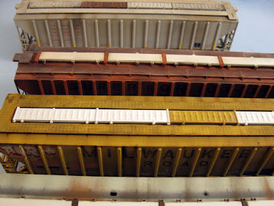
It also gives them to better analyze prototype pictures and improve the model. Nice details are hopper hatches which are often repaired and replaced on real cars. This is a fun detail to model and that brings personality to the fleet.

Various hatch covers showing car's life cycle.


Speaking of organization, I took some time to reorganize my working area to increase my efficiency. Each tool and paint jars were located (temporarily) in the most convenient spot for speedy results. Paint jars in the rack are now organized in such a way the most often used are right in the front row. I also took time to write the paint color name on the black bottle cap to be able to identify them at a glimpse. An uppercase letter "E" or "A" standing respectively for Enamel and Acrylic also brings some order in the chaos.


It is also nice to revisit previous weathering job and identify flaws to be corrected. I was proud of my weathering work on an old Athearn Milwaukee Road hoppers only to find out, two years later, that many areas weren't up to what I observed on prototype pictures. Not a big deal and it will be improved in due time.

Still a lot of work to do on this previous weathered car.

So far, six hoppers are in various stage of completion, with to others in the paint shop. In total, about 25 grain hoppers will be improved and weathered and I'm glad I did because it helps to blend better models from various eras and manufacturers.


I also started to add some graffiti on my cars, following particular patterns found on real cars. Some are drawn using Prismacolor pencils while others will be done with suitable decals. I won't overdo it, but a few off them are a good way to ground the layout firmly in the 2000s.


Finally - and I hope to write about it in a future post - I started to put in practice what I recently said about pre-weathering cars before applying decals or weathering individual pieces prior to final assembly. So far, I'm really pleased because it gives me more control on what I'm doing.

Monday, June 4, 2018

A New Life For Old Decals & Weathering Tricks

Right: Old weathering; Left: Weathering removed with Tamiya Airbrush Cleaner


I'm in the process of weathering a 20-plus grain hopper fleet circa 2008 for Jérôme's layout. While working on an Intermountain Superior Co-op Elevator hopper, I had to device a few trick to make the project move forward switftly. The first challenge was removing the old botched oil paint weathering and dullcote. This was achieved by cleaning the surface with a cotton swab loaded with Tamiya airbrush cleaner. This solvent is quite strong and remove the weathering in just a few seconds. However, one must stay alert to no overdo it since it could also erase the lettering, which isn't a wanted side effect.

Cleaning weathering can also be a good option to bring back some data obscured by dirt. In my case, it appears some warning lettering was wipe out at some point to make it readable again. Just like in real life, I weathered the car, then using isopropyl alcohol and a stiff brush, I removed the excess dirt. The result is far better than masking the lettering prior to weathering


Next, is how to create the various paint patches and conspicuous stripes typical on modern freight cars... It was just a matter of giving a new life to old stuff in my drawers.

We all have old decal sheets in our stash, most of them remnants from previous projects that we keep “just in case”. Maybe this bit of lettering will be useful, maybe a few numbers too or a symbol. However, many pieces of decal seem to no longer have a purpose and I’d like to discuss to reuse them in a creative way.

Old zebra stripes decal sheet

If you model Canadian National zebra stripes era motive power, you probably have many stripe remnants that seem useless. However, you can cut them into pieces to create paint patches on modern rolling stock. If the color isn’t right, just spray over with paint. Also, these stripes generally come printed on large expenses of decal film. Thus, even if the stripe are small, if you paint the overall area, you can create quite large chunk of colored patches.


Reflective stripes are common on modern railroad equipment, particularly since 2005. Many older models didn’t come with them. Once again, if you have decal sheets with yellow stripes, they can be repurposed into reflective stripes by cutting them to size. In my case, I reuse CN locomotive long yellow stripes usually applied on the running board sides. Any decals in the right color and size could do the job.

Finally, if you are like me, you can’t print white decals because you don’t have access to an ALPS printer.  Over the years I developed a technique inspired by image editing software Photoshop. If the background color is black, I create an artwork on which white lettering is superimposed over a black background. When printing, the white parts stay transparent.

Patch done with a black paint marker

Patches done with a white paint marker

A layer of white (or any other color) is then applied on the model where the lettering is supposed to be and the decal is set over the paint. To speed up the process, I experimented with oil-paint markers from the craft stores. Not only they are easy to use to apply a thin layer of paint, but they dry quickly and provide a gloss surface perfect for decaling. No need for long and complicated procedures. I’ll certainly continue to experiment with these paint markers since I can already see a good number of places where they can speed up the process, particularly when painting rails prior to final weathering.

Black decals over white patches and other patches
While I still need to add a last layer of weathering, the overall look is now closer to the modern prototype I'm basing my work on. And yes, Superior Co-op Elevator have a weird tendency to accumulate dirt and grime.