Showing posts with label Tech Notes. Show all posts

Wednesday, November 24, 2021

Monk Subdivision - Messing Up The Mock-Up!

Mock-ups exist to spark discussion, validate ideas and sometimes simply to root out design flaws. As I pointed out in my last post, several of these flaws were identified, particularly the presence of a lower level, which most people on Canadian Railway Modellers Facebook group called the "lower line" which I'll use for the sake of clarity between different platform.

While a cool operational idea on paper, that lower line proved hard to integrate to the original core layout design which was simpler and based around the main line. If the room was larger or the layout has true separate deck (which would required a large helix), it would be a fantastic addition. Unfortunately, it looks clumsy. 


After a discussion with Chris Mears, we both recognized it would be better to leave Monk alone and remove the lower line. It would improve reach to the team track by reducing the distance from 24" to less than 18". It would also provide more space for a well modelled fields in the foreground, which would provide a wonderful vantage point to railfan trains arriving and departing the station. The kind of place you can sit on a chair and look at the parade of trains.

Removing the lower line also has a powerful advantage: it removes 8 turnouts, hidden trackage and simplify staging. This is, in my eyes, a compelling argument. Less is more.

Early this morning before work, I made alterations to the mock-up by covering the lower line with cardboard and foam. Paint and vegetation helped to blend everything together and less than an hour later, a new solution was reached.

I do believe a less cluttered scene and an open foreground really improve the layout. From certain angles, Ste. Euphémie and Monk seems to blend together seamlessly, which was my goal.

Overall, the refurbished scene is more balance and flows better which should translate as a perfect spot to display long trains. This is enhanced by having the field about 1-1/2" lower than the raised roadbed, which improves the illusion the railway was heavily engineered over an ingrate topography.


I could have wasted a lot of time puzzling over this matter on my computer. 1 hour passes quickly when dealing with design issues at the desk. However, working with the mock-up provides on the spot answers that are directly applicable to the layout because they are both 3D and built using similar material. What you see is what you get.


Another Avenue

The village in 1973 seen from from the yard (credit: Tourville FB group)

And while you can easily alter the mock-up, sometimes it's just better to start on a fresh canvas. While discussing with Chris, I revisited several old pictures of Monk. While the station was quite remove, one thing struck me. The village was always seen in the background with the silvery church steeple acting as a point of perspective. In the past, it was an after thought, but working with mockups makes me look at prototype pictures differently. What would be mundane or irrelevant to railway activities is now becoming obvious.


Since my version of Monk was a little bit too much granger. Don't forget I kept the farm scene from Armagh, a much smaller community, I thought it would be great to try something with a more urban feel (if urban is a word that can apply to Monk!). Not that I wanted to overdo thing, but simply to have enough structures to hint that Monk is a division point and not some random location in the middle of nowhere with an oversized depot.
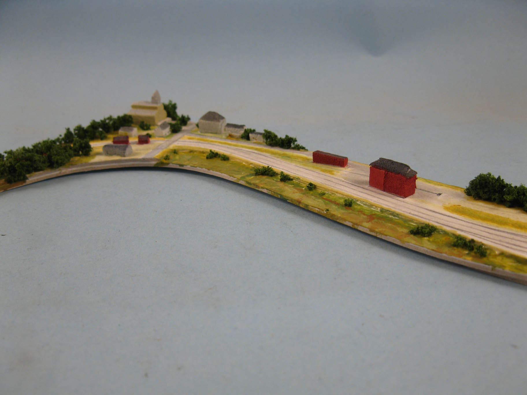

Once again, I cut a piece of illustration board using my printed template and started to draw the trackage. I then sketched the main street and buildings using Google Earth and old pictures as reference. I tried about three different scenarios before committing to one, which, in hindsight, wasn't the best. Why, simply because having a road terminating against the background and the fascia is rarely visually pleasing. I wish I kept the road in the same location as the original mock-up. However, that's the beauty of a mock-up: instant answers to complex questions.


Visibile road transitions with backdrop never works.

Otherwise, I kind of like the new scene. The crescendo of buildings culminating with the church steeple makes for a visually appealing scene. The presence of the hotel, right by Depot Street also hint at a thriving town built around the station.


The speeder shed and section house by the grade crossing also brings a sense of purpose. It frames the train entrance into the industrial world, leaving the confines of the forest, and creates a smooth transition from very small structures at one end the larger ones. Their red paint schemes also reinforce a sense of harmony, distinguishing immediately the railway properties from the town buildings which are more dull and use a much more muted palette of grays, off whites and beige.


The village also act as a focus point when looking down from the depot. It enhances that sense of going somewhere.  I particularly like how your eyes navigate from the large train station, then to the sizable freight house, then to small houses and finally very small railway sheds... Just like a series of dots of various intensity fading away into the undisturbed nature.

Would it warrant another mock-up to finalize the village concept? Maybe, but at this point, I already have all the answers I need for that part of the layout and it is established the tracks won't move. The next mock-up should be done in HO scale on the benchwork to block the scene in a definite way.


Friday, November 6, 2020

My New Friend...

 As life goes on, you lose a few friends and make new ones. Sometimes for the better, sometimes for the worst.


Up until now, my single tool for measuring was my old trusty clear acrylic ruler. It was handy, but on many case, it was somewhat hard to determine exact dimensions due to parallax errors, geometry or simply because dark numbers on a dark object can barely be read. Also, when dealing with small scale project a small discrepancy - let's say 0.1 to 0.25 mm - can make a huge difference between a part that fits perfectly and one that needs putty and shims.


So, late last summer, I took my bike and rode to the local home improvement store to purchase an electronic caliper. Nothing fancy, got it in sale for about $25. But from day one, it completely changed my workflow and made it more efficient. Nowadays, I barely use my ruler, only for general dimensions. Most of the time, I use the caliper. Obviously, it is a great tool to measure diameter or inside dimensions. But it is also quite useful when you need to calibrate the thickness of a scratchbuilt profile or check the gauge of various materials, even wheelsets. Also quite handy to figure out if the general dimensions on a car or locomotive are prototypical.


I've found many other uses, including placing correctly decals and tracing parallel lines. I've been impressed by the many new uses I discover everyday. I can now be certain many parts will fit snuggly, that my scratchbuilt effort are perfect, I can know I need one or two more passes with a file to get the correct dimensions on a part.


It basically eliminated a lot of guesswork, meaning I no longer waste time guestimating dimensions, I waste less material and get more precise cuts. It's also a great tool for aligning parts, which makes the process faster. I also found I could use it as a marking gauge if handled carefully. A light scratch on a plastic surface is much more precise than a pencil line.


At this point, I'm pretty sure you'll ask yourself why I'm talking about such a common tool as if it was a discovery. I've seen people using caliper in this hobby for decades. But I always thought about it as that tool for snobs or brass builder. As a matter of facts, I try to keep the number of specialized tools quite low on my workbench. A caliper always felt to me like one of these tools only used to measure diameters or sheet thickness. However, I was absolutely wrong and found out it was definitely more versatile. Better later than never isn't it!

Friday, September 8, 2017

Some Due Updates

First, I've been working on a redesign of Hedley Junction blog over the last few weeks. I've been busy with other jobs too, but I don't think the update will happen soon. I first flirted with the idea to move to Blogger's Dynamic Views template which would have enabled the blog to be easier to navigate, unfortunately, many useful gadgets can't be implemented without serious customizing and coding and, as we speak, I don't have time for this.

Second, I'm actually working on achieveable layout ideas yet again based on Southern Quebec intricate railway network. While the track plan and basic operation scheme is done, a few additional material needs to be gathered to make it useful to others. Once again, it's not a matter of quantity but about quality.

Third, the move toward a depiction of Murray Bay Subdivision under Chemin de fer du Québec as Chemin de fer Charlevoix (CFC) is steadily becoming a real thing. Most people following the blog must ask themselves when this never ending time shifting toward the future will end... Are we trying to escape our responsabilities? Not really. But as Rene Gourley explained on his blog, we all try to create "our railway" and as much as CN is attractive, I must admit I have a better knowledge about the CFQ since I grew up with it for 25 years now. Many people model CN, but nobody never tried to model the Charlevoix vibe and I feel it's our club duty to to this railway justice.

Finally, while speaking of Rene Gourley, I found out while working on the blog I forgot to add his blog to my recommended website. Rene has been a regular reader of this blog for a long time and certainly an encouraging voice among a few ones that pushed me to reshape my vision of railway modelling. As always, his blog is always a nice read full of thoughtful hindsights.

Thursday, August 24, 2017

Blog Restoration: Update


Slowly but surely I am cleaning up the Photobucket mess on the blog. It’s certainly not a joyful task to perform, but it can be soothed by listening to some good old music. So far, all blog posts have been restored from 2017 to March 2015. I guess I’m about half through this. I can’t make any promise about a completion date due to my extremely busy schedule, however I hope it will be completely done by the end of the year.

I also came to realize a few things while updating the blog. First, I use far too much pictures to convey the subject. Step by step images are great, but in many case, less pictures of better quality would have been better. I’ll try to improve on that in the future.

I also discovered linking pictures from external sources for the sake of fairness toward my sources doesn’t work in the long term. Many pictures are now lost and can’t be replaced. From now on, I’ll use a local copy of external sources directly on the blog and link the original material for reference. It will be easier to handle that way. I know this is quite a gray zone in terms of copyright, however, be always assured I try my best to acknowledge sources as best as I can. If you own material, feel free to contact me if you want to take it down.

Also, I’m getting tired of the generic blog template appearance. I never did anything to improve it and feel it is no longer on par with the work I present on it. As many readers have seen over the last year, I already improved drastically the appearance of my other blogs, including Harlem Station and Temiscouata. On the other hand, I have no strong inspiration at the moment that could convey the personality of this project thus I won’t make any move until I get a good concept. In the past, I often said the layout name (Hedley Junction) didn’t fit anymore the actual project, however, it is now well-established and I don’t feel like changing it. To some extent, this name convey a sense of connection with a wider world, which is coherent with the Murray Bay subdivision.

Thursday, July 20, 2017

Photobucket Mess and Blog Restoration


Like many other blogs and forums around the world, my blogs are also among the recent Photobucket new policy victims. While I have no interest discussing the great loss of information suffered in terms of knowledge, I certainly can recognize Photobucket was in its own right to do so. Most of us were there for the free ride and we should be glad it lasted for such a long time. I'm in no position to complain though I feel Photobucket made itself infamous in a matter of a few minutes.

That said, it means most of this blog posts were rendered almost useless. I estimate about 200 posts have broken links and that represents about 2/3 of everything I wrote on Hedley Junction until I switched to Blogger’s option to directly embed the material in late 2015. Given I generally use 3 to 4 pictures per post, it means I would have to restore more than 600 to 800 images. That’s a lot of work! However, I feel I have a duty toward the readers here to keep things in order.

As a matter of fact, over the last weeks I already started restoration work and can announce Hedley-Junction satellite blogs such as Quebec South Shore Railway, Temiscouata Railway Connors Branch and Erie Harlem Staion are now fully functional again.

In the case of Hedley-Junction, the sheer amount of information means I’ll do the work as time allows. Don’t expect a swift restoration as I have many other commitments. However, I already restored the first posts describing the origin of the project and now plan to restore posts from the most recent to the older since I think older content was less relevant to the actual version of the layout. I certainly hope the blog will be back in its glory by September.

Finally, my summer vacation starts today and will be quite busy, including a large scale home improvement project. I suspect I won't have time to model as much as I would want, but probably will continue working on my cement car weathering which is quite much involving that I first thought.