
Mock-ups exist to spark discussion, validate ideas and sometimes simply to root out design flaws. As I pointed out in my last post, several of these flaws were identified, particularly the presence of a lower level, which most people on Canadian Railway Modellers Facebook group called the "lower line" which I'll use for the sake of clarity between different platform.

While a cool operational idea on paper, that lower line proved hard to integrate to the original core layout design which was simpler and based around the main line. If the room was larger or the layout has true separate deck (which would required a large helix), it would be a fantastic addition. Unfortunately, it looks clumsy.


After a discussion with Chris Mears, we both recognized it would be better to leave Monk alone and remove the lower line. It would improve reach to the team track by reducing the distance from 24" to less than 18". It would also provide more space for a well modelled fields in the foreground, which would provide a wonderful vantage point to railfan trains arriving and departing the station. The kind of place you can sit on a chair and look at the parade of trains.

Removing the lower line also has a powerful advantage: it removes 8 turnouts, hidden trackage and simplify staging. This is, in my eyes, a compelling argument. Less is more.
Early this morning before work, I made alterations to the mock-up by covering the lower line with cardboard and foam. Paint and vegetation helped to blend everything together and less than an hour later, a new solution was reached.

I do believe a less cluttered scene and an open foreground really improve the layout. From certain angles, Ste. Euphémie and Monk seems to blend together seamlessly, which was my goal.

Overall, the refurbished scene is more balance and flows better which should translate as a perfect spot to display long trains. This is enhanced by having the field about 1-1/2" lower than the raised roadbed, which improves the illusion the railway was heavily engineered over an ingrate topography.
I could have wasted a lot of time puzzling over this matter on my computer. 1 hour passes quickly when dealing with design issues at the desk. However, working with the mock-up provides on the spot answers that are directly applicable to the layout because they are both 3D and built using similar material. What you see is what you get.
Another Avenue
 |
| The village in 1973 seen from from the yard (credit: Tourville FB group) |
And while you can easily alter the mock-up, sometimes it's just better to start on a fresh canvas. While discussing with Chris, I revisited several old pictures of Monk. While the station was quite remove, one thing struck me. The village was always seen in the background with the silvery church steeple acting as a point of perspective. In the past, it was an after thought, but working with mockups makes me look at prototype pictures differently. What would be mundane or irrelevant to railway activities is now becoming obvious.

Since my version of Monk was a little bit too much granger. Don't forget I kept the farm scene from Armagh, a much smaller community, I thought it would be great to try something with a more urban feel (if urban is a word that can apply to Monk!). Not that I wanted to overdo thing, but simply to have enough structures to hint that Monk is a division point and not some random location in the middle of nowhere with an oversized depot.
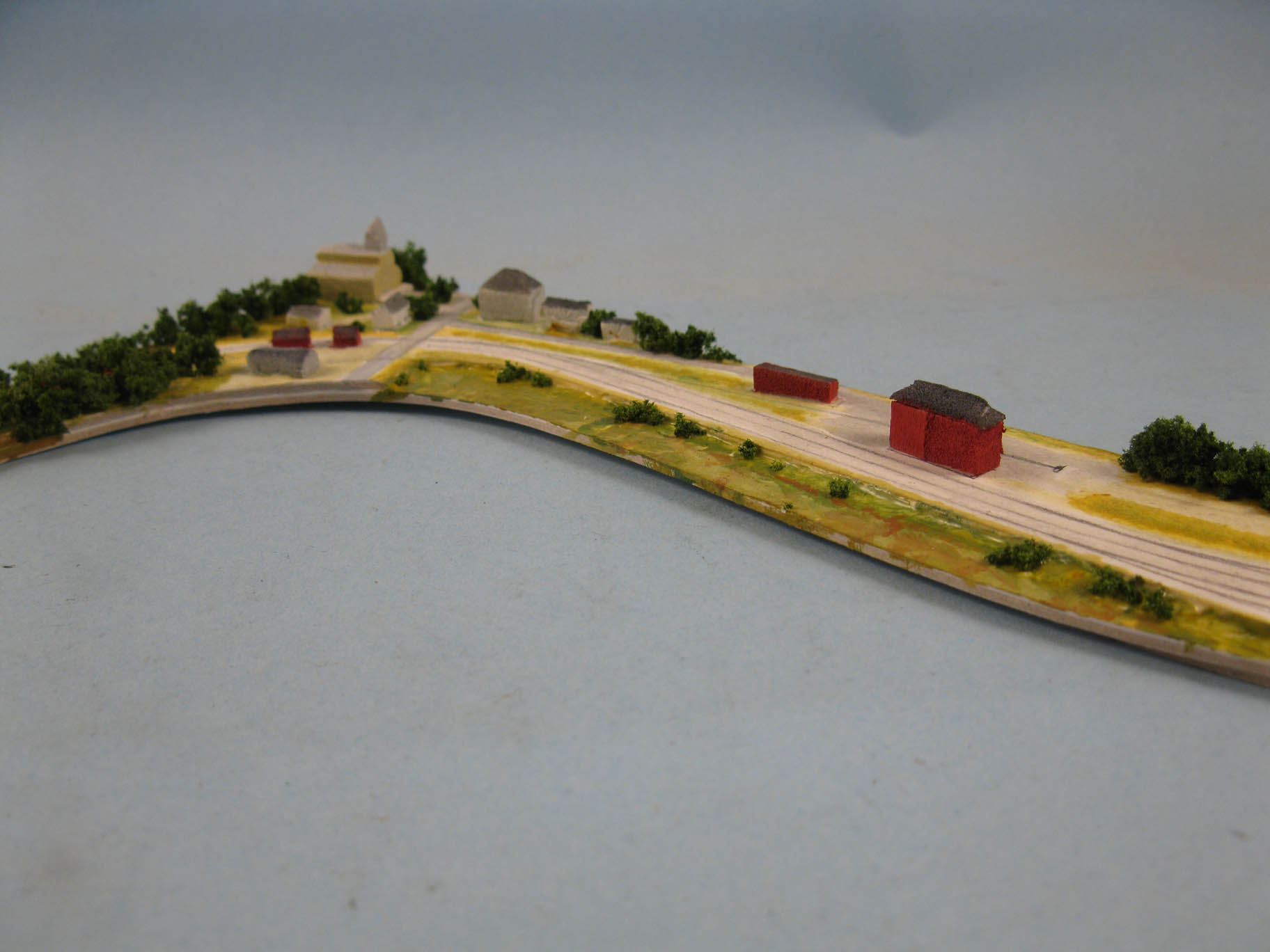

Once again, I cut a piece of illustration board using my printed template and started to draw the trackage. I then sketched the main street and buildings using Google Earth and old pictures as reference. I tried about three different scenarios before committing to one, which, in hindsight, wasn't the best. Why, simply because having a road terminating against the background and the fascia is rarely visually pleasing. I wish I kept the road in the same location as the original mock-up. However, that's the beauty of a mock-up: instant answers to complex questions.


 |
| Visibile road transitions with backdrop never works. |
Otherwise, I kind of like the new scene. The crescendo of buildings culminating with the church steeple makes for a visually appealing scene. The presence of the hotel, right by Depot Street also hint at a thriving town built around the station.


The speeder shed and section house by the grade crossing also brings a sense of purpose. It frames the train entrance into the industrial world, leaving the confines of the forest, and creates a smooth transition from very small structures at one end the larger ones. Their red paint schemes also reinforce a sense of harmony, distinguishing immediately the railway properties from the town buildings which are more dull and use a much more muted palette of grays, off whites and beige.


The village also act as a focus point when looking down from the depot. It enhances that sense of going somewhere. I particularly like how your eyes navigate from the large train station, then to the sizable freight house, then to small houses and finally very small railway sheds... Just like a series of dots of various intensity fading away into the undisturbed nature.

Would it warrant another mock-up to finalize the village concept? Maybe, but at this point, I already have all the answers I need for that part of the layout and it is established the tracks won't move. The next mock-up should be done in HO scale on the benchwork to block the scene in a definite way.

No comments:
Post a Comment