 |
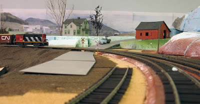
| With some work, this could be a future signature scene. |
The area was cleaned before starting to work on it. You can still see the ghost remnants of older trackage from when the benchwork was built back in 2010. The two parallel tracks were sidings for a coal industry when the area was still Bassin Louise. The curved roadbed at right was the dreaded reversing loop that took years to get rid of.
The first part started yesterday. I quickly assembled a photobackdrop from pictures I shoot near Wieland back in May 2014. I then printed the backdrop on regular sheet of paper and assembled the mosaic. Nothing fancy, just a mock up to get a feel of the place.
During the evening, I moved the backdrop a few times: left-right and up and down. I documented on picture every single version and while I sifted through my pictures, I found out one of the earliest version was the best. Once again, my late grandmother was right when she used to say the first choice is always right. Doing scenery isn't about precise planning but the harmonious combination of shape.
Helped by Louis-Marie, we found out a few factors were truly important: the location of mountains vs the house, the barn/shed height and the horizon level. When looking at my picture, I also added the terrain profile.
Here's a early version which works best. The interaction between the house, the mountains, the far away plains and the road make for a very open space that seems to stretch over a few miles of terrain.
As we move closer, the four factors start to work together. You can also see how the foam terrain seems to merge with the photo fields near the horizon. In real life, this effect is quite impressive as the scene extend about 3 feets on the barn's right (behind the blue foam ridge).
A part of the debate between me and Louis was to determine if the house was standing on a plateau with a steep border along the track or if it should be standing on a gentle slope running down from the horizon to the roadbed. We settled on a gentle slope thinking the road would look more natural if it wasn't in a deep cut. Here's the first try at shaping the land.
After a while, we thought the house was sitting a little bit too low. Also, the transition between the railway cut near the bridge proved to be challenging. Also, it hides the industries on the backdrop, which were an interesting feature to show we are near an industrial park.
Raising the house didn't help our cause and now the backdrop horizon was almost lost.
Sure, it helped a little bit, making the house appear taller than the far away mountains, but I feel it did more harm than good.
But, I must admit the slope towards the aisle ain't the best way to conceal the joint between the backdrop and the layout. It's why I'm starting to think the original plateau version was better looking.
I think the answer is somewhere between both version. At some point, the backdrop horizon will need to be raised over the foam terrain so we can clearly see the city lurking in the back and the fields at right. The terrain will have to form a somewhat steep rigde that blends naturally with the existing topography. Also, the house should be on a kind of plateau. Nobody would have built a house on such chaotic terrain. Anyway, the backdrop depicts a relatively smooth plain and we should feel it on the layout.
Conclusion?
Still a lot of work to be done and probably the recent mockup will need to be rebuilt almost from scratch. I also cut away the third mountain on the photo (at left) in the process and I feel it was a mistake. I'll probably keep it in the future, trying to blend it with the ridge near the bridge. The reason? Odd numbers always look more natural to the eye. But if it isn't possible, I'll find a way to actually extend the backdrop a little bit to better see the industrial park. Also, the third mountain looks nearer and force the perspective.
 |
| The backdrop when the 3rd mountain at left was still there. |
There's also a lot of work about the nature of the barn/shed and its exact location. I'm starting to think it shouldn't be a railway-related structure, but comething unrelated. In Wieland, a similar small barn/shed (thought with a gambrel roof) exists near the grade crossing in a similar fashion. That should serve as a starting point in our reflexion.
In the end, while the scene developed in a way I didn't expect, I must admit the 3D effect is beyond my expectation, both on photo and real life. I think we've just built one of the cutest railfanning spot on the layout.
Feel free to share your impression... at this point, nothing is set in stone.


No comments:
Post a Comment