|
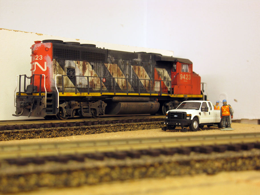
| CN 9423 waiting for its crew at Wieland |
Some more
fine tuning in Wieland last week and that’s fine with me. Drawing a concept on
a sheet of paper and explaining the thought process on a blog is a part of the
journey. Shaping it with materials, in 3D and bringing it to life is another.
Both process are concomitant and not simultaneously exclusive. As happen too
often, the best intentions don’t always bring the best results. However, it is
ours to witness what happens then take action bring back the balance between
intentions and results.
I often
remarked how implementing a working concept on the peninsula wasn’t that easy
to tackle over the last few years. This observation is still hold true and I’m
still figuring out a way to make the best out of the situation. Fortunately,
while the geometry is somewhat ingrate, the goals are becoming clearer. It is
always easier to struggle with an issue when at least you know where you want
to go.
Our layout
will never be much more than an elusive suggestion of railroading in
Charlevoix. It would be completely foolish to believe we can replicate the
subdivision. However, getting the sense of the place right is something that we
can do. It is why I had to make some compromise on the track plan to better
reflect our needs and aspirations.
After
operating the upgraded track plans for months since September, it became quite
clear we eliminated too much trackage during the revision. Was it a mistake?
Were we foolish in doing so? It could be easy to affirm we went a bridge to far
with theoretical concepts. Maybe it was wrong to apply a less is more approach
in such a drastic way.
In fact,
the answer is no. With limited resources and space, you’ve got to make the
exercise of identifying the bare minimum that defines the project. Taking out
the clutter was the only way to remove the noise from the signal. It is also
the best way to understand what specifically represents your subject and what is
merely background decoration. It’s all about defining the essence of a project.
Maybe we went a little bit overboard, but not that much if you ask me. It must
be noted the new track plan works wonderfully as intended and the small
glitches are… small glitches.
It would be
foolish to think you can tackle a complex topic and find a perfect solution
from thin air. Adjustments are required and we are now working our way out.
Given our biggest shortcoming was removing a leg from the wye, we can already
say we were definitely quite close from our goal.
Now, you
will ask me why we made that mistake. The reason is quite simple; we tried to
figure out what was required to operate all aspect of Clermont without cramming
too much elements. If something was redundant, it was eliminated after
seriously taking into account how it would impact freight car movements. In a
nutshell, our track plan worked nicely as a representation of freight
operations on a shortline. However, it failed to provide an answer to
locomotive management. At first, it was thought parking locomotives on a yard
siding would provide an efficient solution. Unfortunately, it was in conflict
with freight movement and left our story unsatisfying.
As you
know, I often like to compare a layout with a story. Train operations require a
starting point and an ending point. Basically, you need an introduction and a
conclusion to your story to make it meaningful. In some case, these things will
be minimal… the train was already there when we catch up with the story.
Sometimes, it is quite simple. In another case, a more complex introduction and
conclusion is required to better understand the story finer aspects.
With
Clermont, it was clear we missed some point. In our story, the yard isn’t the
introduction nor the conclusion. It is in fact the space where the narrative is
developed. The fact the locomotives originated from somewhere else and reached
the yard after a while was part of the story. It underlined the typical nature
of branchline railroading. It was the only way to make it clear the paper mill
is a destination you need to reach to perform a task and not simply a vague
place where train movements can happen anywhere.
In that
regard, what we sorely missed was the importance of that step. We overlooked it
and it came back in our faces each time we operated the layout. Leaving
carefully detailed and weathered locomotives in the middle of nowhere didn’t
make sense and made for an uninteresting conclusion. However, I must point out
many mockups were made in the past. Based on these experiments, we came to the
conclusion a locomotive shop track wasn’t required and would look contrived. As
the project progressed, our fears went unsubstantiated and the issues raised by
the lack of track became more and more evident.
Now, what
is this track all about? It was simply a wye leg that we didn’t replicate. If
you ask me today, I would tell you it was foolish to model a wye with only a
leg. Back then, it made sense because this wye was seldom used to turn
locomotives or cars. Its basic function wasn’t required, thus a single siding was
enough. Unfortunately, its other function was locomotive storage, which was
incompatible with the siding role. You couldn’t merge together both function
and call it a day.
 |
| The new wye leg at left with a locomotive sitting idle. |
Now, on the
aesthetic side of things, representing a wye with one leg won’t cut it.
Visually, it was hard to believe this single siding represented a wye at all.
It looked weird and incomplete. The place is called Wieland, you expect a wye…
and you’ve got not enough compelling clues to believe there is one. From a
story telling perspective, it was quite a fail I must admit. From a scenery perspective,
it always was making it a little bit hard to create a seamless transition
between the yard and the wye. One is in the woods, the other one in a light
industrial setting. Something was missing to link them in a satisfying manner…
Now, this
has been taken care of and the missing wye leg is now back on the layout. To be
noted, the unsightly drain pipe was routed somewhere else in the room to
facilitate scenery work. A grade crossing located near the new turnout will
ease the transition between the light industrial park and the wooden area, just
like on the prototype. While I not that much eager to add too much scenic
elements in Wieland, it seems this one will definitely help in visually
separating different functions and settings while providing a visual anchor in
the scene. I’ve yet to figure out how this will work in 3D, but I’m quite
confident it should be fine and not look contrived.
After all
that said, I'm slowly coming to the realization that following a prototype or
implementing drastic measures is a required step in the process, but definitely
not a goal. It should be seen as a tool to analyze our subject. But at the end
of the day, the artistic touch and interpretation about what we truly want to
convey must prevail. The more you stick to the prototype, the more you
struggle. The more you personally know the real place, the harder it becomes to
make bold artistic choice. It is a double edged sword. Working on my capacity to evoke the sense of
place instead of replicating a lifeless copy of a prototype is a worthy yet capricious
road to take.