Monday, November 29, 2021

Hindsight 20/20 11.0 - December 4th 2021

 Hindsight 20/20 virtual RPM is back again just before Christmas. On December 4th, 2021, many talented modellers will share their skills and passion with us. Don't forget to register in advance at www.speedwitchmedia.com.


Interestingly enough, the meet will start with two clinics dedicated to the two largest modern passenger services in North America; Amtrak and VIA. These subjects are rarely documented in the press or in clinics and it's great to see Hindsight taking an active interest in providing such content!


By the way, another article about Monk Subdivision will soon be published, this time exploring staging and train operations.

Wednesday, November 24, 2021

Monk Subdivision - Messing Up The Mock-Up!

Mock-ups exist to spark discussion, validate ideas and sometimes simply to root out design flaws. As I pointed out in my last post, several of these flaws were identified, particularly the presence of a lower level, which most people on Canadian Railway Modellers Facebook group called the "lower line" which I'll use for the sake of clarity between different platform.

While a cool operational idea on paper, that lower line proved hard to integrate to the original core layout design which was simpler and based around the main line. If the room was larger or the layout has true separate deck (which would required a large helix), it would be a fantastic addition. Unfortunately, it looks clumsy. 


After a discussion with Chris Mears, we both recognized it would be better to leave Monk alone and remove the lower line. It would improve reach to the team track by reducing the distance from 24" to less than 18". It would also provide more space for a well modelled fields in the foreground, which would provide a wonderful vantage point to railfan trains arriving and departing the station. The kind of place you can sit on a chair and look at the parade of trains.

Removing the lower line also has a powerful advantage: it removes 8 turnouts, hidden trackage and simplify staging. This is, in my eyes, a compelling argument. Less is more.

Early this morning before work, I made alterations to the mock-up by covering the lower line with cardboard and foam. Paint and vegetation helped to blend everything together and less than an hour later, a new solution was reached.

I do believe a less cluttered scene and an open foreground really improve the layout. From certain angles, Ste. Euphémie and Monk seems to blend together seamlessly, which was my goal.

Overall, the refurbished scene is more balance and flows better which should translate as a perfect spot to display long trains. This is enhanced by having the field about 1-1/2" lower than the raised roadbed, which improves the illusion the railway was heavily engineered over an ingrate topography.


I could have wasted a lot of time puzzling over this matter on my computer. 1 hour passes quickly when dealing with design issues at the desk. However, working with the mock-up provides on the spot answers that are directly applicable to the layout because they are both 3D and built using similar material. What you see is what you get.


Another Avenue

The village in 1973 seen from from the yard (credit: Tourville FB group)

And while you can easily alter the mock-up, sometimes it's just better to start on a fresh canvas. While discussing with Chris, I revisited several old pictures of Monk. While the station was quite remove, one thing struck me. The village was always seen in the background with the silvery church steeple acting as a point of perspective. In the past, it was an after thought, but working with mockups makes me look at prototype pictures differently. What would be mundane or irrelevant to railway activities is now becoming obvious.


Since my version of Monk was a little bit too much granger. Don't forget I kept the farm scene from Armagh, a much smaller community, I thought it would be great to try something with a more urban feel (if urban is a word that can apply to Monk!). Not that I wanted to overdo thing, but simply to have enough structures to hint that Monk is a division point and not some random location in the middle of nowhere with an oversized depot.


Once again, I cut a piece of illustration board using my printed template and started to draw the trackage. I then sketched the main street and buildings using Google Earth and old pictures as reference. I tried about three different scenarios before committing to one, which, in hindsight, wasn't the best. Why, simply because having a road terminating against the background and the fascia is rarely visually pleasing. I wish I kept the road in the same location as the original mock-up. However, that's the beauty of a mock-up: instant answers to complex questions.


Visibile road transitions with backdrop never works.

Otherwise, I kind of like the new scene. The crescendo of buildings culminating with the church steeple makes for a visually appealing scene. The presence of the hotel, right by Depot Street also hint at a thriving town built around the station.


The speeder shed and section house by the grade crossing also brings a sense of purpose. It frames the train entrance into the industrial world, leaving the confines of the forest, and creates a smooth transition from very small structures at one end the larger ones. Their red paint schemes also reinforce a sense of harmony, distinguishing immediately the railway properties from the town buildings which are more dull and use a much more muted palette of grays, off whites and beige.


The village also act as a focus point when looking down from the depot. It enhances that sense of going somewhere.  I particularly like how your eyes navigate from the large train station, then to the sizable freight house, then to small houses and finally very small railway sheds... Just like a series of dots of various intensity fading away into the undisturbed nature.

Would it warrant another mock-up to finalize the village concept? Maybe, but at this point, I already have all the answers I need for that part of the layout and it is established the tracks won't move. The next mock-up should be done in HO scale on the benchwork to block the scene in a definite way.


Tuesday, November 23, 2021

Monk Subdivision – Layout Mock-Up Time

I’ve often advocated in the past the use of mock-ups to test and fine tune layout designs. Mock-ups are useful to compose scenes, test structure volumetry and first and foremost, build a layout before going past the point of no return. As much as plans can help us refine a design, they have their limit being schematic representations in 2D. At some point, the final work must be done in real life with real materials. A good example is Mike Confalone who admits he doodled a general track design on paper then worked it all in wood in real life. Sure, it’s a little bit extreme, but he certainly got a point: you need to see you work in real to understand what works and what doesn’t. It also provides you with news perspectives and opportunities that couldn’t be seen on paper.

In the case of Monk, Jérôme who follows this project with great interest, asked me to make a mock-up like I did for Villeneuve years ago. He had doubts about a few things with the plan, and to be perfectly honest I did too because discussions with Chris Mears were a good indication that a 3D validation was required. As you can already suspect, meshing together Diamond and Breakey with Monk would be a hard thing to pull off and I was perfectly aware of it.


The layout mock-up was built at 5/8” = 1’-0” scale, which made it slightly smaller than a letter size sheet of paper and easy to work with. Too small and you lose any 3D benefit, too big and you waste material and time. Keeping it simple it always a good advice and be sure this mantra will visit us more than once in this article!


The mock-up was built using illustration board, scraps of Styrofoam, acrylic paints, ground foam and wood glue. Total time invested? About five hours, which were all extremely fascinating as the layout took life in front of my eyes. No wonder most serious layout builders use mock-ups. As a proof of concept, they are a powerful tool! Let’s see what was learned from that experiment.


What works?

First of all, it proved Ste. Euphémie is a beautiful sweeping scene that flows together graciously. The large curved embankment and its concrete culvert are in the right spot to stage and admire trains moving over the steep grade. I can already imagine glamourous passenger trains with their long 85ft cars moving overt eh rails. The station itself is small and nestled in the topography, creating a human scale environment where trains can stop. Initially, I was afraid of the grade before and after the station, but in 3D they work so well in reinforcing the idea this is mountain railroading and locomotives have to work hard to get to the summit.


Also, the hidden staging trackage behind the cut is… hidden. The topography does its trick and was should not be visible isn’t. The deep scene near the culvert also gives the impression a vast valley laying in the background. Add a decent backdrop and the illusion should be complete! Consider this scene a success.


The hidden tracks are barely visible from this high vantage point.

Monk also works well. I was afraid it would look crowded but it isn’t the case. The scene feels long, linear and vast as should be a railway yard. The station and freight shed are large, but not overpowering the area.


As for the farm scene, I think it’s a winner. Simple, elegant and doing its job. However, the presence of the lower level scene make the foreground almost inexistant in front of the station and visually creates ambiguity.

A typical French Canadian farm scene

Short story: it does look good. Diamond shouldn’t be there. Monk needs space to breath, and I firmly believe it would be better if some fields was in front of the station. Imagine if Diamond footprint was that field, with the Monk trackage on a raised roadbed. It would be a fantastic spot to watch train meets and the yard switcher in action.  Less is more, I suspect Diamond will have to go!


The yard scene is also quite interesting. Having the yard covered in grass tone it down a little bit, which put the emphasis on the mainline. Once again with the goal to capture that sense of linearity associated with railways. I wouldn’t be against having the yard about ¼’’ lower than the main line to enhance that distinction. As for the roundhouse, I love how it blends together with the scenery, providing a neat backdrop for train operations. I didn’t want it to be that big industrial structure often seen on layout, but rather something more subtle and it does work.

Right after Monk is a long stretch of main line. I firmly believe it would be a great scene to display a typical Canadian National main line in the middle of non-descript forest and marshes. Another spot to railfan trains. Unfortunately, the Breakey mill scene in front of it leaves very little room to develop that idea and worst, it creates an access barrier to the yard, which is a no go. If it was my layout (and sure it is!), I would remove Breakey and go back to my initial idea to model the Lake Therrien marshes that are located East of Monk yard.


What doesn't work?


At this point, I guess you know what doesn’t work isn’t it? Diamond is a contrived scene. Supposed to depict an interchange located in a plain, it looks like a typical model railroad layout that tries to be everything except being true to itself.


The steep cliff making the transition between Diamond and Monk just doesn’t work in terms of realistic topography and all the trees required to hide the tunnel entrance make switching cars there a nightmare. Visually and operation-wise, this scene is nothing more that a set of compromises. Worst, due to its existence, the Monk station scene suffer because it really needs a decent foreground to be framed adequately. As it is, it’s unbalanced and clumsy. Diamond should go.


John Breakey is another neat idea on paper that materialize poorly in 3D. The scene isn’t deep enough to be believable. The almost vertical transition between the main line and the mill isn’t convincing at all. I can already imagine a wall of puffballs. Also, hard to believe a small paper mill would be build in such a cramped scape.

Worst, Breakey as a big flaw. It hinders access to the yard which is a no go. Access it the first design criterion to respect when dealing with operation. No compromise is acceptable on that specific point. 


A decent hidden track means the yard is also obscured

Also, as previously mentioned, the upper main line lack foreground to be believable as a scene. Breakey will always lack space to be convincing, thus better give that little space to the main line an keep the rest available for humans interacting with the railway. It also leave space to keep my work desk there.


More food for thoughts

I’m not surprised by what I found. It comforted my original opinion this layout should be linear, mundane, simple and putting the main line at the forefront of the narrative. It also proved everything I added later on were an after thought. I’m glad to have tried because it validated my opinions by real facts. I also learned what was missing in some scenes to better frame them and it revealed opportunities I had underestimated.

The mock-up was an excellent mean to test ideas, trim the superfluous and fine tune the inherent qualities. I tried the idea of make a network out of Monk, geared toward interconnected operations and it didn’t work because the room didn’t lend itself to that idea. Instead, it reinforced a simpler and more streamlined concept. At the end of the day, the main line element wins… as for the paper mill, I think Donnacona is still the best way to achieve it!

In terms of layout construction, it also simplifies greatly the hidden staging and scheme of operation. It reduces the number of turnouts drastically and the benchwork will be much easier to build making it a much more achievable layout.


Friday, November 12, 2021

Monk Subdivision – The Yard

I mentioned in my latest article in this series that Monk yard was the heart of this project. Indeed, it’s the very focal point when entering the room, but more on a much more practical aspect, it is a division point on the railway and as such, it must perform a minimum of tasks.

Conceptual sketch of the yard

These tasks determine the track requirement for a basic yard. Keep in mind my goal is to keep track density as low as possible without having to compromise on train movements. In that regard, I built upon the example of Pierre Oliver’s Clovis Branch yard designed by Trevor Marshall and my own experience with Clermont yard. But, more than anything, I based my final decision by studying Canadian Pacific’s Orangeville yard in Ontario as it was rebuilt in 1924. If you are surprised Monk yard isn’t mentioned, it’s simply because I couldn’t find detailed maps of it. They probably exist but wouldn’t be of any help because Monk was a huge and long yard that wouldn’t fit the scope of the project. The only thing I can work with are a few pictures that give an idea about how elements were related to each other. One of these elements was the yard ladder in front of the station… and the fact the yard was build opposite to the train station.

Otherwise, the big source of inspiration was Craig Bisgeier’s timeless “Ten Commandmentsof Model Railroad Yard Design”. I often go back to this neat article and feel Craig has distilled what is a yard in the most pragmatic way.

Functions and tracks

Monk yard serves several purposes, including:

  1. Scheduling train meets
  2. Changing crew and locomotive
  3. Breaking and building manifest trains
  4. Handling local customer freight
  5. Switching cars for way freight trains
  6. Supporting the locomotive facilities

The first point is self explanatory. You need one passing track and a main line to accommodate two trains at the same time. Nothing special about that one.

The second one is all about having a dedicated track to park trains while a crew change occurs. It can be the passing track or something else.

The second point is all about the yard itself. Given we will often have to deal with two freight trains at the same moment which is about 16-20 cars, we need twice the capacity in the yard. Also, I know from experience 2 sidings aren’t enough. We need at least 3 to be efficient. The yard doesn’t need to be two ended because the switcher can work from the same end to perform all moves. That reduces the number of turnouts required and save space for the siding themselves.

This last detail is important because as Craig Bisgeier mention’s it “Thou Shalt Not Foul the Main”. No switcher must run over the passing track and main line when performing its tasks. For this reason, a dedicated yard lead will be implemented on the left. Not very different from Orangeville yard. This has also another benefit; the locomotive can move in front of the station, creating a nice backdrop for railfanning.

Another big commandment of Craig is "You Shalt Use Arrival / Departure Tracks". In the past, I would have skipped that one and honestly, I did in my first drafts of Monk. However, as I better understood train movements on the subdivision, the more it became apparent I would need one. Given most trains will be 10 cars long and the passing track is almost 20 feet long, I'll simply cut it in two separate section. The one in front of the station will be the passing track while the right section will be the A/D track. Two turnouts will separate them so cars moving from or to the A/D track never foul the passing track. Since the A/D track is not always used, it can serve as a longer passing track if ever required. It will also provide a good buffer zone to store trains awaiting a crew change.

Wrapping up a Track Plan

Monk can be divided in three individual parts representing separate functions. When taken together, they work together to create a division point. These parts are the station, the yard and the engine facilities.

Schematic plan of Monk

The station in itself isn’t very different from any other on the line expect for its bigger capacity. The station building is larger and two storeys to house crews and railway employees. The passing track is much longer to accommodate intercity passenger trains and long fast freights. The team track is also much longer and graced by a sizable freight house.


Monk as a station

The yard is made of an arrival/departure (A/D) track were inbound and outbound trains pick up or set out their cars. Three classification tracks are used to break and build freight trains. Finally, a dedicated yard lead ensures switcher locomotives never foul the main line and can work independently from the rest of the railway. From a layout operation, this is a neat detail because you can switch the yard while a parade of trains run over the main line.


Monk as a classification yard

The engine facilities are the final part of Monk and are required to service, fuel and store locomotives between assignments. The turntable also provides a mean to reverse steam locomotives while the caboose track and auxiliary track are dedicated to store cabooses and maintenance of way equipment. Finally, a fuel track supplies coal and sand while disposing of ashes to kept locomotives going on. The design for these engine facilities is based on both Quebec Central’s Vallée-Junction shops and Canadian Pacific’s 1924 Orangeville Roundhouse. In both case, installations were small and compact, using very little tracks to perform all the moves required.

Monk as an engine facility

Full scale mock-ups will be required to determine is a ready track for outbound locomotives can be implemented. In Vallée-Jonction, one track served both purposes, but it could be a very useful addition to better stage crew changes. Once again, it’s a matter of balancing purpose and frequency. 


Monday, November 8, 2021

CN Monk Subdivision - Breaking Down the Scenes

Over the years, I came to realize any scene longer than 7 to 8 feet was too large to be fully appreciated by someone standing in the aisle from a static point. This applies to modules, switching layouts and larger layouts. Granted, very long scenes are wonderful to implement when the space is available and I certainly wouldn't discourage nobody wanting one, on the contrary. The observations I'm making applies to smaller endeavours. As such, with a small layout such as Monk Subdivision, I quickly came to realize 17 feet long rural stations were a little bit overkill. It was certainly prototypical in some regards, but it was also a waste of precious space.

For this reason, I went down to the basement, stood in the room for a good while and visualized the initial track plan and scenery. Quickly, it was apparent having a 20 feet long stretch of main line in the middle of the wood would have been cool on a large layout, but it was basically pointless. I know myself and I enjoy sitting next to the track and watching trains run by. 20 feet was not only completely outside of my fields of vision, but also a waste of opportunity to implement different scenes. It also greatly limited the operation potential by having only one town and nothing else. Running a local switcher is a favorite of mine and I thought these 20 feet would be better used if something happened.

I also came to the same conclusion looking at the other short wall where nothing happened. I was a little bit clueless about what to do with scenery there. It was so understated. On the other hand, the space itself was premium. Near the door, under cabinets, creating a nice alcove to stand in from of a scene wrapping itself around the spectator. Something could be done... and I quickly envisioned a major customer on an interchange, namely the John Breakey Limited.

Framed scenes and typical views / Operation "alcoves

After a while, it became clear the room could be broken down in 4 major scenes that would complement each other visually, provide a surround experience and offer a reason for trains to move. Let's take a look at these scenes to understand how they are designed.

Ste. Euphemie

Ste. Euphémie is a scene of contrasts


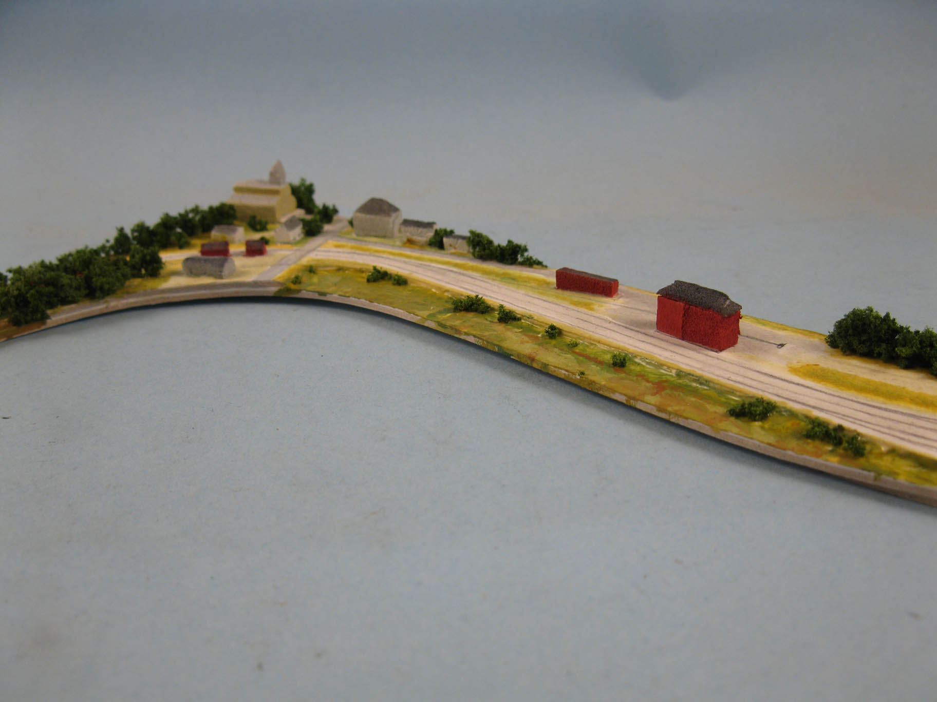
Ste. Euphemie is a small village located East of Armagh, after a sweeping horseshoe curve. The station there was small, having one passing track, one long siding and a short spur to a saw mill, all not to far from a large concrete culvert. The area was interesting because NTR had to make several cuts and fills to maintain an acceptable grade.

For the layout purpose, considered Ste. Euphémie should be framed by the upper wall cabinets, creating a long and sweeping L-shaped alcove to railfan trains. As for operation, this scene would be used to stage meets, provide a destination for the local switcher, a stop for passenger trains and a long scenic curve to display lo trains.

In terms of inspiration, the saw mill was replaced by something similar to the Langlois feed mill in Armagh and my iconic Quebec South Shore Railway module. I wanted an enclosed water tank and a second class station.

The scene is framed at its left by a raised foreground that hides the end of the layout. On the right end, the scene disappears also behind a cut and trees, creating the illusion that Ste. Euphémie is nothing more than a small valley (which was the case on the prototype).

This long scene, about 16 feet long, is broken in two visual units: the station and the fill. The station takes advantage of a relatively straight stretch of track and is framed by two vertical elements: the feed mill and the water tank. These two structures created a clear boundary between the man made landscape and the wilderness. Between them, intense actions and interactions can occur and the small access road reinforce this link between human habitation and railways.


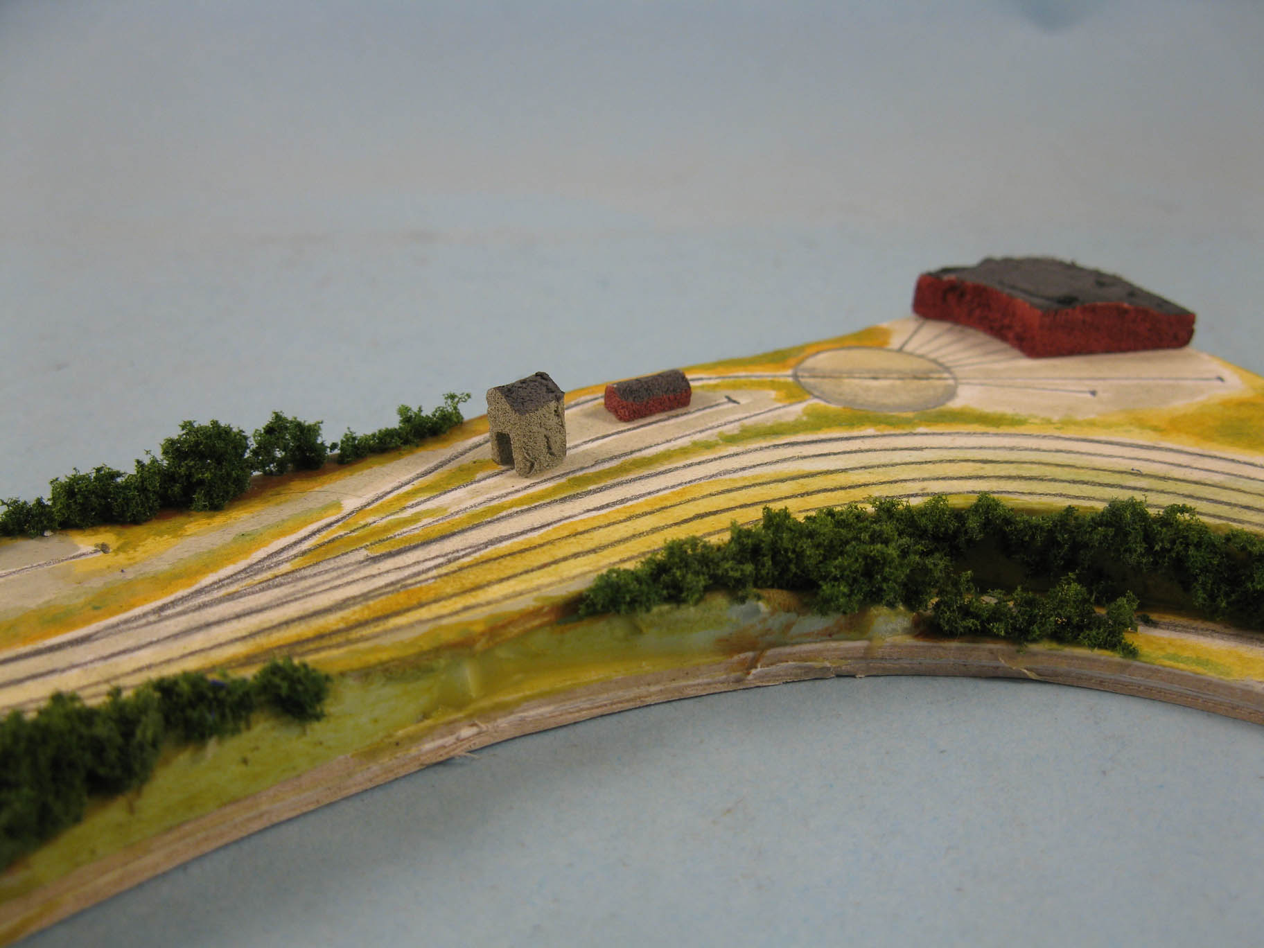
The other scene is on the contrary almost completely wild and depicts a main line crossing a valley. Everything there is mundane and natural, except for the steel ribbon, the concrete culvert and the fill that make clear the artificial nature of railways. The fill is not only prototypical and fun to model, but it provides an indicating this is indeed a significant valley. This raised embankment, about 5 inches at its highest point is also a perfect way to display trains. They float over the trees and the large curve makes them surround us, immersing ourselves into a silent admiration for train battling the grade before reaching their terminus.

Forests, distant mountains and the horizontal nature of the railways are the main components of this scene to always reinforce that illusion of a main line crossing a vast and wild landscape.

Monk


Monk is the heart of this project. Home of the largest station on the line and an important division point, it gets more than 20 feet, if not more, to stretch its legs. When you enter the room, this is the first thing you see and the large National Transcontinental depot automatically becomes the focus of the panorama. 

However, this is a very long scene and it could be flat and boring if nothing is done to insert a hierarchy of spaces based on actions occuring there.

First of all, I must mention having a long straight scene wouldn't look good. I base my judgement on our club layout Villeneuve, which is as close as possible from the prototype, looks great on paper and is a little bit boring in real life. For this reason, a sweeping curve is implemented in the tracks to break the monotony. This curves means that both ends of Monk aren't at the same angle and this helps us to break the scene in two manageable halves.

It is important to mention Monk serves two purposes. First, it's a major passenger and freight station on the line, second, it's the division point and it's home to a roundhouse and a substantial classification yard. For the layout purpose, let's say the yard is less than substantial, but more on that on a later article about it.

Monk Station is centered on a rural road


What's important is that what happens at Monk station is not the same than what happens in the yard. Both of them are different sets of action and they can be performed by different people. That gives us a big hint. Someone working the yard should be a hindrance to another one running a train and doing work at the station. When can thus attribute the left side to the station and the right side to the yard/engine facilities.

Interestingly enough, it creates a small alcove in fron of the yard where an operator can stand. Even better, when you look down at your left, you see the tracks running toward the station which makes for a beautiful panorama of the entire railway property. This is not a small detail, because it means if someone want to fully appreciate Monk, he has to go to the yard alcove and look around. This isn't a view you will get from everywhere else on the layout.

The yard is it's own world and benefit from a commanding view.


Also, a two-part scene helps to frame a gradual transition in density. The station part starts with a track emerging from the woods and crossing a road and a sparsely populated area before encountering a freight shed, then a substantial two storeys station. Just like in Ste. Euphémie, architecture serves to frame intense railway activities. In this case, the farm scene and the station frame the human element. In the yard, the station and roundhouse are the psychological limits of a busy center of activity. It is also where a lot of structures and rolling stock can be found, further enhancing the importance of the division point. On the contrary, the station section is less crowded and more laid back. It invites to contemplation: be it a train departing the station or a small switcher moving slowly on the switching lead.

On the yard section, the roundhouse tracks are laid in such a fashion they channel your sight toward the building itself, making it a distant focus point where locomotives come and go on a regular basis. The idea being to let understand the roundhouse is outside the normal realm of the public railway, something to be discovered just as it was the case with Monk roundhouse back in the days.

Diamond/Walsh


I haven't yet decided how I'll call that subsection of Monk station scene, but you will find a small interchange track between CNR, Quebec Central and John Breakey Limited there. Generally, we try to not have trains running twice in the same spot for obvious reasons. Bear in mind Walsh/Diamond were more than 100 miles away from Monk. One is the starting point, the other one the ending point! However, space being at premium, this scene is nestled there.

Diamond/Walsh is subdued compared to Monk Station


To make it works, I took a good look at Bill Henderson's Coal Belt Railroad track plan. He used an outdated twice around plan to save on space and gets a longer main line run. Interestingly, he succeed by creating spatial separation between tracks. This can be achieved by several means. The first one is by making sure the track have sufficient distances between them to not look like parallel tracks. 

Second, where tracks cross each others, Bill use vertical separation. It may seem obvious, but since tracks are generally quite distant from each others, when there is a bridge, it feels like another railway line is there.

Bill's layout (Credit: A. Keller - Great Model Railroads Vol. 19)

Also, never the vertical separation is done with steep hills and rock cuts. He keeps it simple, with natural grades. Only in one instance he use a tunnel portal in plain sight and even then, it makes sense. To make a long story short, Bill makes sure both track don't look to have been laid in a contrived landscape.

If you want a more modern example, just think about Mike Confalone's White Mountain Junction scene on his Allagash Railway. As Chris Mears pointed me out, you can barely imagine a main line is running behind the tree line. Yes, it's there and you would probably see the train if it was running, but it wouldn't matter at all, if not creates a sensorial interest.

Bill's layout (Credit: A. Keller - Great Model Railroads Vol. 19)


Finally, he use another level of separation which is scenic. The distant track is always partially hidden behind trees, buildings and embankments. He never treats it has a mainline, but as something running in the back ground. In some case, just having the track about 1 to 2 inches lower than the from one is enough to relegate a train running there in the background, both literally and visually.

Red line is the hidden main line (credit: M. Confalone/C. Mears)

For this reasons, I decided to keep Diamond/Walsh as simple as can be. The prototype itself was simply a junction in the middle of fields. Very little to no structures would be there, except for a very small shed. Tracks are limited to the minimum required; a passing/interchange track and the industrial spur. Fields and woods would surround completely the scene in such a way the interchange would be like a clearing between two small woods. As for the hill dividing Diamond from Monk, it would require some thoughts. Vegetation will probably play a big role and topography too.

John Breakey Limited

John Breakey is yet another achievable paper mill scene


The John Breakey Limited pulp mill scene is once again something that could be considered a module or a cameo in itself. It has a lot in common with many small British exhibit layouts. It starts on the left with a track emerging being a tree line and fields, crosses a small creek that indicates where the industrial realm starts and end with the mill buildings framing the end of the scene, as a backdrop.

Once again, like the prototype, the scene is kept as simple as possible. It also only emerge when it's out of the way from Monk yard so both aren't ovelapping. This is important visually, but also to ensure two persons wouldn't constantly interfere between them. The first rural part is a way to blend it with the end of Monk yard nicely. Only tracks in nature. As for the mill part, it isn't a problem if we can see a little bit of trains running behind the mill. This track will be slowly doing down toward the hidden staging. Add vegetation and structure nad you can think of the main line as a distant one, that you catch glimpses through a semi-transparent curtain of scenery. It reminds you the main line isn't very far, but yet that the mill is it's own thing, branching off of it.


Conclusion


I'm well aware of the limitations of a twice around track plan, however, I'm equally understanding the big advantages they can bring to the overall experience.

It forces me to break the layout into scenes, which creates a more dynamic composition and provides more variety. It also provides for railfanning alcoves offering various viewpoints on the train operations. Finally, as much as they can look quite close enough, the rural backwood nature of these scenes helps to blend them together. Truth to be told, the structure count is quite low, the main line dominates every scenes and vegetations gets the share of the lion. Imagine an unifying backdrop depicting Appalachian Mountains and spruces, firs, birches and maple trees creating an almost uninterupted ribbon of greenery. Yes, I believe with a unifying palette, these scenes won't look like a collection of independent elements, but rather like variations on a single unique and strong theme.