I’ve often advocated in the past the use of mock-ups to test and fine tune layout designs. Mock-ups are useful to compose scenes, test structure volumetry and first and foremost, build a layout before going past the point of no return. As much as plans can help us refine a design, they have their limit being schematic representations in 2D. At some point, the final work must be done in real life with real materials. A good example is Mike Confalone who admits he doodled a general track design on paper then worked it all in wood in real life. Sure, it’s a little bit extreme, but he certainly got a point: you need to see you work in real to understand what works and what doesn’t. It also provides you with news perspectives and opportunities that couldn’t be seen on paper.
In the case of Monk, Jérôme who follows this project with great interest, asked me to make a mock-up like I did for Villeneuve years ago. He had doubts about a few things with the plan, and to be perfectly honest I did too because discussions with Chris Mears were a good indication that a 3D validation was required. As you can already suspect, meshing together Diamond and Breakey with Monk would be a hard thing to pull off and I was perfectly aware of it.
 |
The layout
mock-up was built at 5/8” = 1’-0” scale, which made it slightly smaller than a
letter size sheet of paper and easy to work with. Too small and you lose any 3D
benefit, too big and you waste material and time. Keeping it simple it always a
good advice and be sure this mantra will visit us more than once in this
article!
The mock-up
was built using illustration board, scraps of Styrofoam, acrylic paints, ground
foam and wood glue. Total time invested? About five hours, which were all
extremely fascinating as the layout took life in front of my eyes. No wonder most
serious layout builders use mock-ups. As a proof of concept, they are a powerful
tool! Let’s see what was learned from that experiment.
What works?
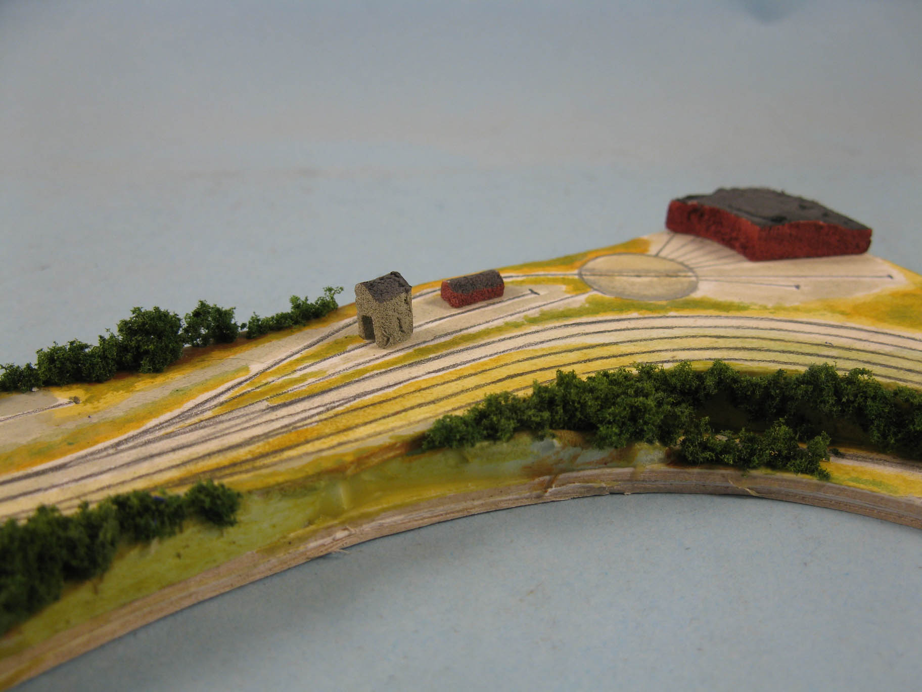
First of all, it proved Ste. Euphémie is a beautiful sweeping scene that flows together graciously. The large curved embankment and its concrete culvert are in the right spot to stage and admire trains moving over the steep grade. I can already imagine glamourous passenger trains with their long 85ft cars moving overt eh rails. The station itself is small and nestled in the topography, creating a human scale environment where trains can stop. Initially, I was afraid of the grade before and after the station, but in 3D they work so well in reinforcing the idea this is mountain railroading and locomotives have to work hard to get to the summit.

Also, the hidden staging trackage behind the cut is… hidden. The topography does its trick and was should not be visible isn’t. The deep scene near the culvert also gives the impression a vast valley laying in the background. Add a decent backdrop and the illusion should be complete! Consider this scene a success.

 |
| The hidden tracks are barely visible from this high vantage point. |
Monk also works well. I was afraid it would look crowded but it isn’t the case. The scene feels long, linear and vast as should be a railway yard. The station and freight shed are large, but not overpowering the area.


 |
| A typical French Canadian farm scene |
Short story: it does look good. Diamond shouldn’t be there. Monk needs space to breath, and I firmly believe it would be better if some fields was in front of the station. Imagine if Diamond footprint was that field, with the Monk trackage on a raised roadbed. It would be a fantastic spot to watch train meets and the yard switcher in action. Less is more, I suspect Diamond will have to go!
The yard
scene is also quite interesting. Having the yard covered in grass tone it down
a little bit, which put the emphasis on the mainline. Once again with the goal
to capture that sense of linearity associated with railways. I wouldn’t be
against having the yard about ¼’’ lower than the main line to enhance that
distinction. As for the roundhouse, I love how it blends together with the
scenery, providing a neat backdrop for train operations. I didn’t want it to be
that big industrial structure often seen on layout, but rather something more
subtle and it does work.

Right after Monk is a long stretch of main line. I firmly believe it would be a great scene to display a typical Canadian National main line in the middle of non-descript forest and marshes. Another spot to railfan trains. Unfortunately, the Breakey mill scene in front of it leaves very little room to develop that idea and worst, it creates an access barrier to the yard, which is a no go. If it was my layout (and sure it is!), I would remove Breakey and go back to my initial idea to model the Lake Therrien marshes that are located East of Monk yard.
What doesn't work?
At this point, I guess you know what doesn’t work isn’t it? Diamond is a contrived scene. Supposed to depict an interchange located in a plain, it looks like a typical model railroad layout that tries to be everything except being true to itself.

The steep cliff making the transition between Diamond and Monk just
doesn’t work in terms of realistic topography and all the trees required to
hide the tunnel entrance make switching cars there a nightmare. Visually and
operation-wise, this scene is nothing more that a set of compromises. Worst, due
to its existence, the Monk station scene suffer because it really needs a decent
foreground to be framed adequately. As it is, it’s unbalanced and clumsy.
Diamond should go.


John Breakey is another neat idea on paper that materialize poorly in 3D. The scene isn’t deep enough to be believable. The almost vertical transition between the main line and the mill isn’t convincing at all. I can already imagine a wall of puffballs. Also, hard to believe a small paper mill would be build in such a cramped scape.

Worst, Breakey as a big flaw. It hinders access to the yard which is a no go. Access it the first design criterion to respect when dealing with operation. No compromise is acceptable on that specific point.

 |
| A decent hidden track means the yard is also obscured |

Also, as previously mentioned, the upper main line lack foreground to be believable as a scene. Breakey will always lack space to be convincing, thus better give that little space to the main line an keep the rest available for humans interacting with the railway. It also leave space to keep my work desk there.
More food for thoughts
I’m not
surprised by what I found. It comforted my original opinion this layout should
be linear, mundane, simple and putting the main line at the forefront of the narrative.
It also proved everything I added later on were an after thought. I’m glad to
have tried because it validated my opinions by real facts. I also learned what
was missing in some scenes to better frame them and it revealed opportunities I
had underestimated.
The mock-up was an excellent mean to test ideas, trim the superfluous and fine tune the inherent qualities. I tried the idea of make a network out of Monk, geared toward interconnected operations and it didn’t work because the room didn’t lend itself to that idea. Instead, it reinforced a simpler and more streamlined concept. At the end of the day, the main line element wins… as for the paper mill, I think Donnacona is still the best way to achieve it!
In terms of layout construction, it also simplifies greatly the hidden staging and scheme of operation. It reduces the number of turnouts drastically and the benchwork will be much easier to build making it a much more achievable layout.
This is fascinating, Matthieu! What a great idea... and well executed.
ReplyDeleteThanks Steve! It was the only way to fight analysis paralysis! ;-)
Delete