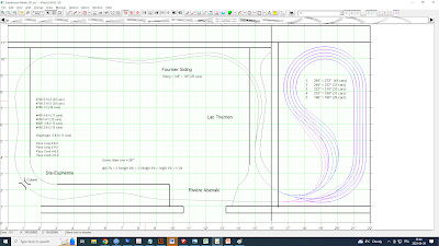
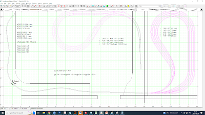
As promised, we are now back for the third and final installment of Thinking outside the Room. Having selected a few good design elements, it’s time to tie things together for a “final” plan of action.
Many
observed rightly that the staging bulge right in the middle of the room was an
atrocious waste of prime space and I agree. But it was a step required to
further my thoughts. In architectural design, we often explore ideas that are
deemed useless or not optimal to figure out “why” they aren’t and what is good
about them. They won’t be the final option, and we know it, but they are useful
steps to learn more about the project, our priorities and the potential of the
space available in front of us. Maybe 90% of things will be wrong or unwanted,
but there is a 10% that could provide a key for another option. It is also a
way to learn why a bad idea is a bad idea. Simply discarding designs based on
feeling doesn’t provide a great deal of foresight. And if you are asked why it’s
bad from people who think it’s good, you have zero argument to sustain a
positive conversation about it.
In the case
of Monk, drawing this option with the bulge proved many things:
-
The
bulge does take a lot of space;
-
Looking
at a staging with entering a room is far to be appealing;
-
A
working surface on top of the bulge would be to deep to be really useful and it
would reduce access to tracks for maintenance;
-
Framing
the best scenes under the cabinet is a winning move;
-
Superposed
staging yards are indeed a neat use of space, particularly if they have exactly
the same geometry.
Staging inside versus outside the room
Armed with
that, we know that we have some good elements to work with and a few
deficiencies to work out. First, let’s take the staging yards outside of the
room. We explored the workshop option earlier in part 1 and it didn’t make
sense. But there is also some space on the right side which is full of storage
shelves. Many things on these shelves are hobby related and must be protected from
dust. It isn’t the case right now so building a new room to protect them would
not reduce storage space and provide for shelter from wood dust. Storage shelves
could be installed under and over the staging layout.
 |
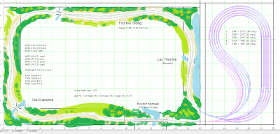
| The full mainline run is now restored |
Some scenery to tie hings together
With the staging
outside, we can restore the continuous scenic mainline around the room and let
scenes breath. Since both staging are one over the other, the entire visible
track is thus a long gentle grade typical of mountain railroading. It’s about 1.1%,
which is quite acceptable in HO and in line with prototype National
Transcontinental Railway design guidelines of the 1900s.
 |
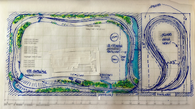
| Refining ideas by hand; a better lakeside scene |
It also
opens another door which is of uttermost interest. It is, once again, inspired
by the siding at Lac Therrien that was built on a causeway. This siding, in the
middle of nowhere, acts as a place where you can stage meets between trains. It
would be long, capable of holding trains pulling about 20 cars. I can already imagine
building a shelf to rest on and a control panel in that area to railfan trains meeting
there. It’s also a good excuse to implement a realistic yet extremely simple signal
system. The visible part of the layout would then be 2 CTC blocks: a stretch of
mainline and the siding, sandwiched between two staging yards.
Jérôme's drawing explaining CTC blocks
On the
visual side of things, this new track plan has a powerful argument for it. Both
staging areas punch the wall in the exact same spot. Also, the Abenaki bridge
scene no longer needs to deal with a nasty curve. Having the swing gate to the
room crossed only by a straight piece of track makes geometry much easier to
deal with and is more forgiving with track alignment. I also like the fact both
scenes under cabinets are no longer linked together in front of the doorway. This
connection felt clumsy and was broken when the gate was opened. Now, they connect
in a more natural way around the wall instead of being broken at the doorway.
It’s a natural spot for a vertical separation too.
Lac Therrien seen from the aisle
I’ve
discussed that plan with friends and most of them agree it’s a much better and
elegant version. It is a serious contender and can be built easily, economically
and can run in a matter of a few months. It’s now up to me to make a long due
move.


No comments:
Post a Comment