We generally have that idea that color reference pictures before the 1950s are inexistent when dealing with car weathering but as countless Morning Sun books and internet photo archives show us, it's far from being right.
Lots of Autochrome (the commercial name for color photographic plates used in the early 20th century) pictures survives and trains were of major interest to photographers. Jack Delano's pictures are for the right reasons extremely famous and should remind us the the world in black & white never existed.
Over the last year, I've been looking at Jack's and others' railroad yard pictures. They are often shot from a raised embankment, a roof or an overpass which means you have an excellent look at the roofs. This morning, by sheer luck, I stumbled upon an October 18th, 1932 photo of the West Bottoms and Kansas City Stock Yard by Frank Lauder. Compared to Delano's, it's a plain and boring picture which doesn't share the highly artistry associated with Jack's work. Even the colors are that well preserved, but it does show an important thing: the car roofs.
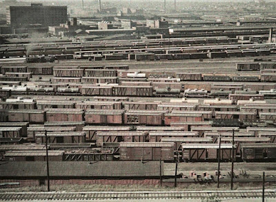 |
| West Bottoms and Kansas City Stock Yard, October 18th, 1932 (credit: Frank Lauder, Kansas City Public Library) |
Two things strike me the most. First, how washed out the freight car paint looks to be, covered in dust, soot and rain. They are no longer vibrant, but seen through a filter of dirt and UV fading. We often see modellers weathering their cars and as they move forward with the steps, it just makes it look darker and darker. In my mind, this is a mistake for two reasons.: First, color doesn't scale and small object should always be painted lighter than their real prototype to compensate for that. Second, weathering add layers of darker washes. They alter drastically the car color, meaning we should fade them much more than anticipated to take into account that filtering effect. This is a point Martin Kovac, the armour modeller, often stresses out. You need to make things much more drastic because weathering darken colors and tone down the contrast. This is a reason why I nowadays add a lot of white and buff to my initial color. I've also restarted using drybrushing to highly details that will be, eventually, covered in darker stuff. People who paint stonework knows how you can start with the most garish colors and bring them together later on with washes, filters and dirt. Ryan Mendell, at Binbrook RPM two weeks ago, called it the "rainbow effect" because it looks so silly when you start, yet makes sense at the end of the process.
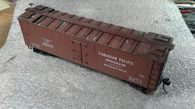 |
| This Accurail reefer has been drastically faded with white and buff filters |
My second observation is about horizontal surfaces such as car roofs and tank tops. Look at them in the picture. They are covered in coal soot, yet they are the so light colored they almost look off white. You can barely discern the original red oxyde or brown paint, yet they are not black or dark gray. Like the previous effect, light plays a role in that perception. Horizontal surfaces receive much more sunlight than vertical ones, making them look brighter. Just like the albedo on the Moon surface is in fact very dark since it's mostly made of basalt, but direct sunlight over the powdery surface makes her look white at night. The same happens with our cars. And the powdery observation too! Indeed, soot is a powder than collects on horizontal surfaces and dirt and dust get mixed with it. It's no longer dark grey, but rather a light grey color. For this reason, I've recently started to paint my car roofs much lighter than the car sides to help me capture that effect. Not only it looks better and more realistic, but it also gives more depth to the car itself, it looks more 3D even if it sounds absolutely silly to word it like that. At the end of the day, it enhances that impression of looking at wood or steel instead of plastic.
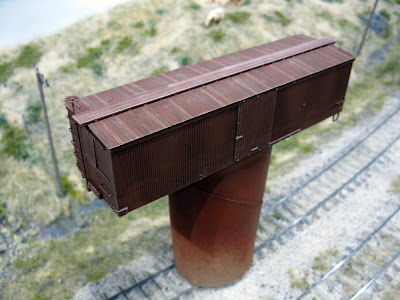 |
| The wooden roof on that car is noticeably lighter than the sides |
No comments:
Post a Comment