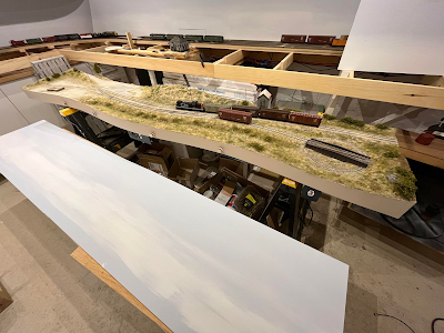
I've always been a little bit intimidated by backdrop, be they photo or painted. For some reason deep inside me, I'm afraid of ruining my work. But as they say, if the mountain doesn't come to you, go to the mountain.
I suspect my fears were fuelled by the fact I had a very vivid mental image of what should be the correct backdrop for Stanstead and felt I wouldn't succeed to make it reality. Fortunately, I have a few cheap 1/8" MDF panels laying around, so I can afford to miss and redo the job. One thing was sure, I've been a big fan of Mike Cawdrey's painted backdrops for more than a decade and I wanted to try it myself.
My idea for the backdrop was informed by two pictures. One is an old postcard of the station, looking south toward New Port, Vermont with Jay Peak visible far away on the horizon.
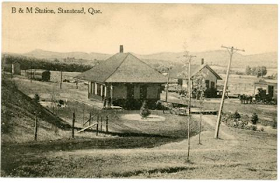 |
| Source: Eastern Townships Archives Portal |
The second picture was from the late 1970s, shot at Highwater, QC, looking again toward the Jay Peak and I felt the mix of Appalachian mountains and rolling hills was perfect for Stanstead. To give me some help, I screenshot a view from Google Earth as inspiration and started to paint the backdrop.
 |
| Inspiration picture from Google Earth |
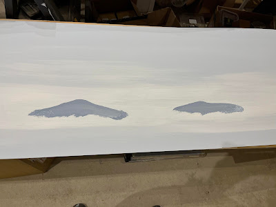
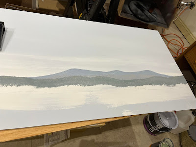
The project started with a very light blue color which I used extensively on Charlevoix Railway. Using white, I feathered both colors to create a bright horizon and a darker sky just like my reference picture.
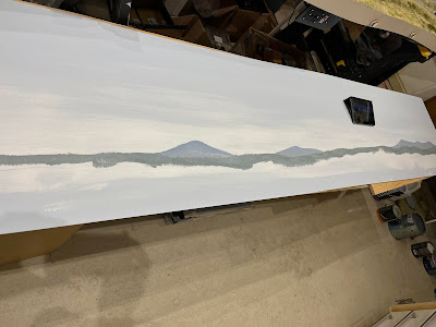
The second step was to draw the mountains profile with a somewhat darker blue-grey. What is interesting to know is the peak looks darker than the mountain base due to the atmosphere. I dabbed a lighter shade there and even added some burnt Sienna to it to get that warmer tone depicting deciduous trees.
It is then followed by a conifer tree line on the horizon. Once again, several shades of the same color are used to create depth and variation.
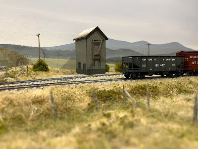
Then, the foreground is painted, including several wooden areas, bushes and fields which colors are selected to blend with the layout scenery. It really is that step that helps to tie everything together. Many details at the bottom of the painting will be lost behind the scenery. Is it a shame? Not really, as I believe the horizon line should be low and that mountains shouldn't be higher than structures surrounding them.
After two hours and 30 minutes of drying time, the backdrop was ready for installation.
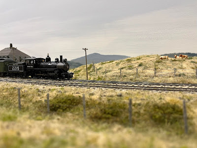
At the end of the day, I've learned I can paint decent backdrops, that it's faster than stitching and tweaking photoshop pictures, and that it doesn't need that much talent. Could it be a interesting option for Monk Subdivision? Most likely because I don't see myself fighting with photos in such a crammed space.







Matthieu,
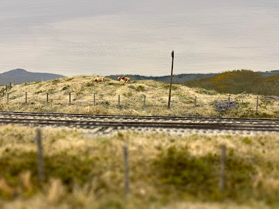
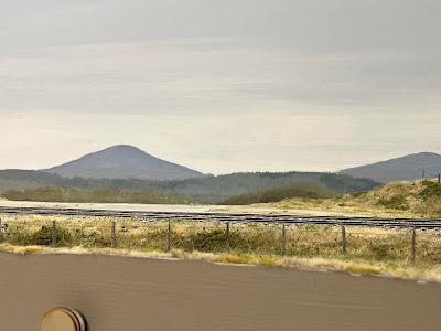
ReplyDeleteThat is a fabulous backdrop! I personally don’t care the photo backdrops I’ve seen in many photos because the colors and color intensity are different from the foreground scenery. Your backdrop matches the tones and colors in your scenery seamlessly.
Photobackdrop can be stunning, but as you said, merging colors with the layout is an art in itself. It's easier if you paint the backdrop. There is also a hazy quality to a painted backdrop that is hard to achieve with photo. I may be tempted to paint the Monk subdivision backdrop.
DeleteMatthieu,
ReplyDeletePerhaps you have found a new hobby? ;~)
Maybe! It's been about 20 years since the last time I painted a landscape and it was very small. It's both pleasing and soothing.
DeleteThat's amazing! Well done. What material did you use for the backdrop itself?
ReplyDeleteGood old 1/8" MDF sealed with primer on both side. I recommend 1/4, because it's too flimsy. I'll add braces later.
DeleteThat looks fantastic!
ReplyDelete