 |
| Credit: Jean-François Brulotte (2006) |
For a long time, I wanted to make station signs for significant railway activity center on the layout. Finding reliable information on CN practice wasn't an easy task. I remember reading somewhere CN used to favor Helvetica font in the 60s (now, it's Humanist 777). At this point, I thought it would be an easy ride, slapping a CN logo and a station name together.
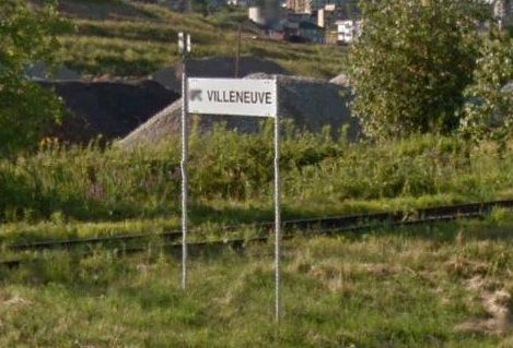 |
| Villeneuve station sign as seen in Google Streetview |
But beware! Helvetica is a large font family. It may be a modern "classic", but many variations exist. From what I could saw, CN used the older versions, which are quite hard to find.
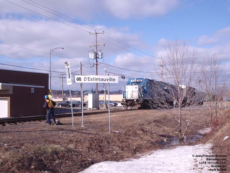
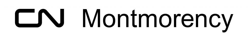
Looking at many CN signs, I quickly found out many variation existed. The "standard" sign is made of a black CN logo at left with the station name at right (in black too) on a white board. But, you'll find many fonts from the Helvetica family: regular, bold, semi-bold, or something similar to Helvetica but not really (with rarer rounded corners). You find also signs written in capitals with no logo, a style found on station buildings and dating from the steam era. But, on Murray Bay Sub, particularly near Beauport district, "modern" sign are indeed in Helvetica, but in capitals and with a logo. These stations are D'Estimauville and Villeneuve. Both places never had real stations and had different names before the 60s, so no idea why they used this peculiar style. To make it more complicated, signs located on Côte-de-Beaupré and Charlevoix are "standard", just like the one everywhere in the area.
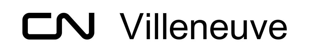
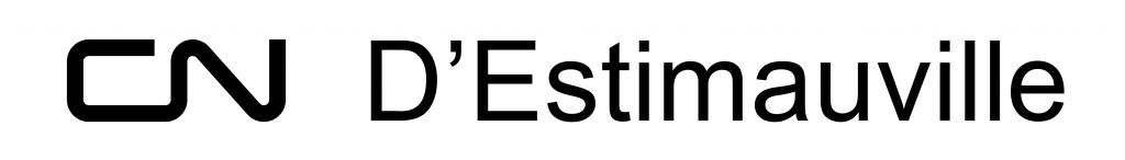
As you can see, nothing was standard practice and I needed to make something practical out of it. Here are my guidelines to make a realistic CN modern station sign. CN logo must be in black and its height is half the height of the white board. The station name is spaced from the CN logo by a a distance equal to the height of the logo. Station name font size is the same height as the logo. Font will be Helvetica Lengyar Normal (from Helvetica Neue Font family) or Helvetica Regular (the older one where the "a" character doesn't have a long serif).
Now, you are in business. If you want to reproduce CN logo, go to the CN website. They have an excellent Guidelines (PDF) about using their logo and fonts. By the way, they also list all CN logos since the original Grand Trunk Railway. Very useful to the period modellers.

I contacted a local shop doing engraving to make the signs on white Gravoply. This is the traditional plastic material used to made signs on institutional building. Nothing fancy, not modern, but with a good 60s-70s vibe to it. Signs are about 12" x 2" and 14" x 2". Each will cost about 12$.
there is a True Type font called CN61Helvetica Type available at
ReplyDeletehttp://cnrha.ca/node/963