
About two decades ago, I acquired a Central Valley plate girder bridge. It was then, my first serious infrastructure model and it was inserted into my first "serious" layout. Back then, I remember painting the bridge a very dark chocolate brown (probably some Floquil paint) and calling it a day. It made for a decent representation of an ex-QRL&PCo bridge and I added telegraph crossarms to it to make it more prototypical.
 |
| Sault-à-la-Puce River bridge abutment (credit: Google Earth) |
Much later, this bridge was incorporated on the first club layout circa 2007 and a few others were built to make a 4 spans structure. Since my high school days, it was my goal to replicate a large QRL&PCo bridge, namely the one in Beaupré. When this layout was dismantled, I brought back home the bridge and shortened it and added several layers of olive green washes yo give it some depth. New abutments were made out of styrene and using distressed and embossed balsa wood to model limestone. The horizontal wood grain was perfect to replicate layers of sedimentation. Unfortunately, the paint job was too flat to be interesting. I was supposed to include the bridge on a diorama for photoshoots, but didn't complete the project.
 |
| Bridge abutments, Wilsontown, Lannarkshire, UK (credit: Wikicommons) |
Then, a few weeks ago when watching Martin Kovac kitbashing a German shed for a diorama on YouTube, I thought I could dig up the old bridge and try to improve as much as possible the paint job.

I was lazy and decided to experiment only with acrylic paints because I wanted the job done in an afternoon. With a sponge, I added very subtle paint chipping here and there. The goal was to not get an abused surface, but one that has been weathered over a few decades. Using several dark washes, I made the rivets pop up. Then, with a very thin dark brown paint, I draw the panel lines to add some shadows and define better the different steel components making up the plate girders. Highlights were also applied to enhance the tridimensional look. Central Valley bridges have great details and it's well worth our time to make it show off.
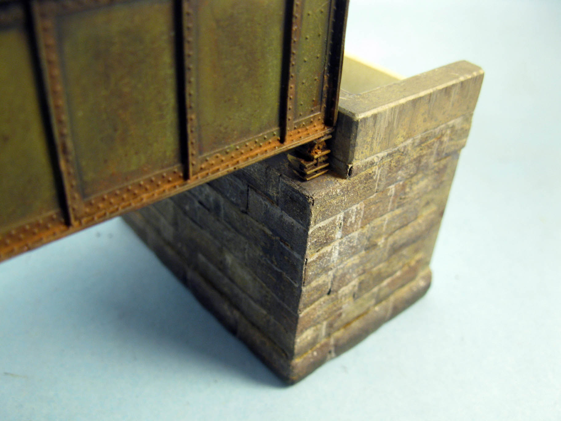
A few layers of thinned down rust colors were also applied on the lower part, following prototype picture of the bridge at Rivière Sault-à-la-Puce in Château-Richer. The same was done on top of the girder.


More color variation and texture was added to my original paint job by speckling the surface with dark brown and white with a sponge, both on the concrete and stone parts. If you look at pictures, it often happens light spots can be found at the surface of limestone, granite and many other natural stones. We don't think about adding white to stone because it seems counter intuitive, which often gives a very flat appearance. Some people will drybrush the stone to create highlights, which is always a good trick, but the speckling has nothing to do with highlights and it an entirely different effect. The same reasoning applies to the darker speckling which enhance the texture.

Using various acrylic paints thinned down to various consistencies, some brownish and blackish tones filters were added following prototype pictures. I some cases, I almost drybrushed the paint then smeared it down with my fingers. These washes help to blend together the garish speckling effects into something more natural and subtle. Then, using a very fine brush, I painted every mortar line with off white. Using the same color, I drybrushed the lime washing out over the stone. Finally, I highlighted the stones by adding some light gray to better define the perimeter of each stone. The lower side being touched up with a dark wash to add some shadow again.


As it stands, I'm quite happy with the bridge enhanced paint job. I don't consider it completed because a few oil washes will be required to add rust to the stone abutments. However, it shows that with some care and a decent observation of prototype picture, little wonders can be achieved. This is not a winning contest model, but on a layout, it should provide an interesting support role to trains and a nice spot to railfan and shoot pictures.
Your last statement summaries this well, if every structure, every piece of the model was ‘award winning’ the lot would feel contrived. Our eyes will interpret and add several layers of invisible realism to a finish such as you’ve achieved in the bridge. Great work.
ReplyDeleteYes, you are absolutely right. This an artistic process and as such, it works by suggestion and addition. Our brain works wonder. Often, a consistent level of quality and a shared color palette have much more impact. This is something I'm learning step by step and it has been an eye opener over the last year.
Delete